

Mayor of Galway City opposed as Galway City Council unveils new logo and brand identity

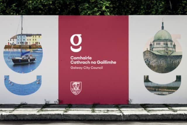

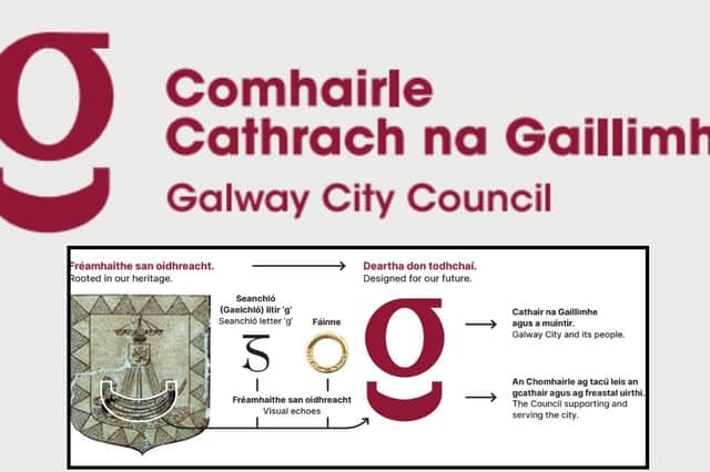
Mayor of Galway City Helen Ogbu has said she would not support a Council rebrand “at this time” – as Galway City Council unveiled a new maroon lower-case ‘g’ inspired by the hull of the ship in the city’s Coat of Arms.
The design also draws on seanchló, the historic script used in Irish, and will be rolled out gradually across the Council.
“I would not support Galway City Council proceeding with a rebranding exercise at this time,” Cllr Ogbu (Lab) told the Galway City Tribune.
She said there was a “legitimate question” over spending on a rebrand when communities were raising urgent concerns about infrastructure and essential services.
Mayor Ogbu acknowledged the value of good communication and a strong Council identity, but questioned whether a rebrand was “the best way to strengthen that identity” or whether the money could be better spent elsewhere.
“We should be clear about what problem the investment is intended to address, what measurable benefit it will provide,” she said, and how it would fit alongside other priorities in the forthcoming budget.
“Residents are contacting us about roads and footpaths, transport and traffic, lighting, public spaces, community facilities, housing pressures and many other issues that directly affect their everyday lives. These are understandably the priorities people want to see addressed.
“This is particularly relevant as we approach the budget process and discussions around rates and charges,” Mayor Ogbu continued.
“If we are asking communities and businesses to contribute more, I believe we also need to demonstrate that every area of expenditure is being carefully considered in terms of necessity, timing, value for money and the benefit it delivers.”
Meanwhile, Mayor Ogbu welcomed confirmation that the Galway crest will remain in use.
The Coat of Arms will remain part of the Council’s new “brand family”, while the new identity gives greater prominence to the Irish-language name, Comhairle Cathrach na Gaillimhe
Cllr Ogbu said a strong Council identity should build on Galway’s heritage, history, values and civic pride, while reflecting the “diverse, vibrant and welcoming city” it is today.
“For me, a strong identity for Galway City Council should build on our heritage, history, values and civic pride, while also reflecting the Galway of today, a diverse, vibrant and welcoming city,” she said.
“But that identity is ultimately strengthened by the relationship we have with our communities and by the quality of the services, infrastructure and support that people experience every day.
“Our strongest brand as a Council will be the trust and confidence people have in the work we do and the difference they see in their communities.
“I believe the process should also consider the wider questions of priority, affordability, timing and value for money.
“We should be clear about what problem the investment is intended to address, what measurable benefit it will provide, and how it sits alongside the competing priorities that will be considered as part of the forthcoming budget.
The unveiling follows strong public reaction to proposals to change the familiar ‘G’, designed by Jimmy Conneely for Galway’s quincentennial celebrations.
Former Mayor Cllr Mike Cubbard (Ind) said on social media that councillors had not decided to replace the ‘G’ and that he did not know “too many Councillors who support the idea”.
He called the change “a ridiculous idea and completely unnecessary”, saying the ‘G’ was “synonymous with Galway and should remain that way”.
Council unveils new maroon ‘g’ as Galway rebrand goes ahead
The new branding will be rolled out gradually across the local authority, with the existing Coat of Arms retained for formal civic use and as part of what the council describes as its new “brand family”.
The design also gives greater prominence to the Irish-language name, Comhairle Cathrach na Gaillimhe. Maroon remains the principal colour, while the new palette also includes blue to reflect the River Corrib.
This decision, they said, is supported in feedback from staff and Elected Members.
Chief Executive Leonard Cleary stressed that the introduction of the new identity would not mean existing Council materials and assets being immediately replaced.
“The rollout will be gradual,” he said.
“We will use the new identity when materials and assets are due to be renewed or replaced, rather than replacing items simply because the branding has changed.
“For example, new stationery will carry the new identity as part of the move to Council’s new corporate headquarters at Crown Square.
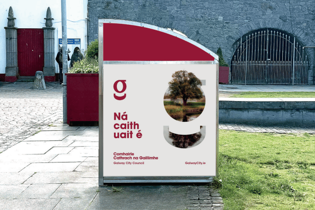
“Digital materials and email signatures will be updated in the coming weeks, while physical assets such as bin wraps and hoardings will adopt the new identity when they are next renewed.”
Mr Cleary said the exercise was about more than changing a logo.
“Galway City Council provides and supports a very wide range of services, from housing, roads and fire services to planning, environmental protection, tourism and community supports,” he said.
“We need to make it easier for people to recognise the role of the Council and the services we provide.
“The new identity is one part of that work, while also reflecting Galway's civic heritage and the important place of the Irish language in the city.
“Staff, Elected Members and members of the public brought a great deal of interest and enthusiasm to this process. Their feedback has helped shape the identity that has now been selected.”
Galway City Council said the new branding followed a review and audit of its existing identity, along with stakeholder workshops and surveys, and formed part of the development of a new communications strategy.
The review, it said, found that members of the public did not always recognise the full range of services provided or supported by the Council, while individual services, programmes and projects were not always presented in the same way.
The Coat of Arms will continue to be used on the official seal of the City and in other formal civic settings, including the chains of office worn by the Mayor and Deputy Mayor.
Director of Finance Helen Kilroy said the new identity was intended to create a common visual system across Council services.
“The new identity gives the Council a common visual system across the many areas in which it works, from housing and roads to planning, transport, economic development, tourism, culture and capital projects.
“The aim is that people will be able to recognise the Council more easily, regardless of the service, project or communication they are dealing with.”
Richie McCarthy, Head of Communications and Corporate Marketing, said the design drew directly from the city itself.
“The identity draws directly on Galway, including its civic heritage, the River Corrib and the city's bilingual character,” he said.
“Importantly, the Coat of Arms remains part of the brand family, while the new system gives the Council greater flexibility across digital, print and physical communications.”
The Council said its full brand strategy and visual identity guidelines would be published in due course.
Funded by the Local Democracy Reporting Scheme