

Belgian firm considers legal options over splitting the ‘g’

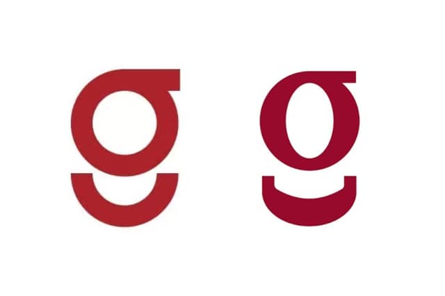

A Belgian company, Gondella, whose logo bears “a striking similarity” to Galway City Council’s new visual identity said it is examining whether any legal steps are appropriate.
The company’s CEO, Thierry Molenaar, said Gondella became aware of the issue after messages and articles began reaching the company from Ireland.
In a statement to the Galway City Tribune, Mr Molenaar said the company, which designs and manufactures shopfitting solutions, has followed the discussion around the Council’s new logo “with quite some surprise, and, admittedly, with a smile”.
“When the first messages and articles reached us from Ireland, we immediately noticed the striking similarity with the Gondella logo too,” he said.
“Our visual identity was developed to represent Gondella years ago and has been used to build recognition of our company and brand across Europe.”
Galway City Council recently unveiled a new logo and brand family centred around a lower-case maroon 'g'.
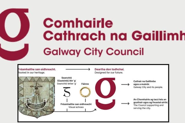
The Council says the design draws on Galway’s civic and maritime heritage, with the shape reflecting the hull of the ship depicted in the city’s Coat of Arms, while also drawing on the tradition of seanchló, the historic script used in Irish.
However, similarities have subsequently been highlighted between the Galway design and the logo already used by Gondella.
Gondella rebranded in 2023 “reflecting the company’s evolution and redefined strategy”. They described their new logo as “modern, optimistic and smart” - with the font inspired by their products and the “smiley under the letter G giving a positive touch.”
Mr Molenaar said the Belgian company takes the protection of its brand identity seriously and is now considering the matter with its advisers.
“Naturally, we take the protection of our brand identity seriously,” he continued.
“We are therefore looking into the matter and will assess, together with our advisers, whether any legal steps are appropriate.
“At this stage, however, it would be premature to draw any conclusions.”
Despite considering the potential implications for its brand, Mr Molenaar also struck a light-hearted note about the likelihood of the two organisations being confused.
“That said, we are a Belgian company that designs and manufactures shopfitting solutions, not a city council,” he said.
“So the chances of someone accidentally ordering supermarket shelving when they intended to contact Galway City Council are probably fairly limited.”
He said Gondella had never expected its logo to become a talking point in the west of Ireland, but acknowledged that the attention had unexpectedly raised the company’s profile here.
“We certainly never expected our logo to become a topic of conversation on the west coast of Ireland,” he said.
“If nothing else, Galway has suddenly put Gondella on the map in Ireland.”
And Mr Molenaar finished his response with an offer to the local authority.
“And should Galway City Council ever need new shelving for their City Hall, they now know exactly who to call.”
Galway City Council unveiled its new identity earlier this month following a review of its existing branding.
The Council said the new design was intended to create a common visual identity across its services and give greater prominence to its Irish-language name, Comhairle Cathrach na Gaillimhe.
The Coat of Arms will continue to form part of the Council’s brand family and will remain in use for formal civic purposes.
The branding project was awarded to strategic branding and identity specialists Turas Branda following a competitive procurement process, at an overall project cost of €28,000.
The new identity is to be introduced gradually, with the Council saying existing materials and physical assets will be replaced as they reach the end of their normal lifespan or require renewal.
Funded by the Local Democracy Reporting Scheme